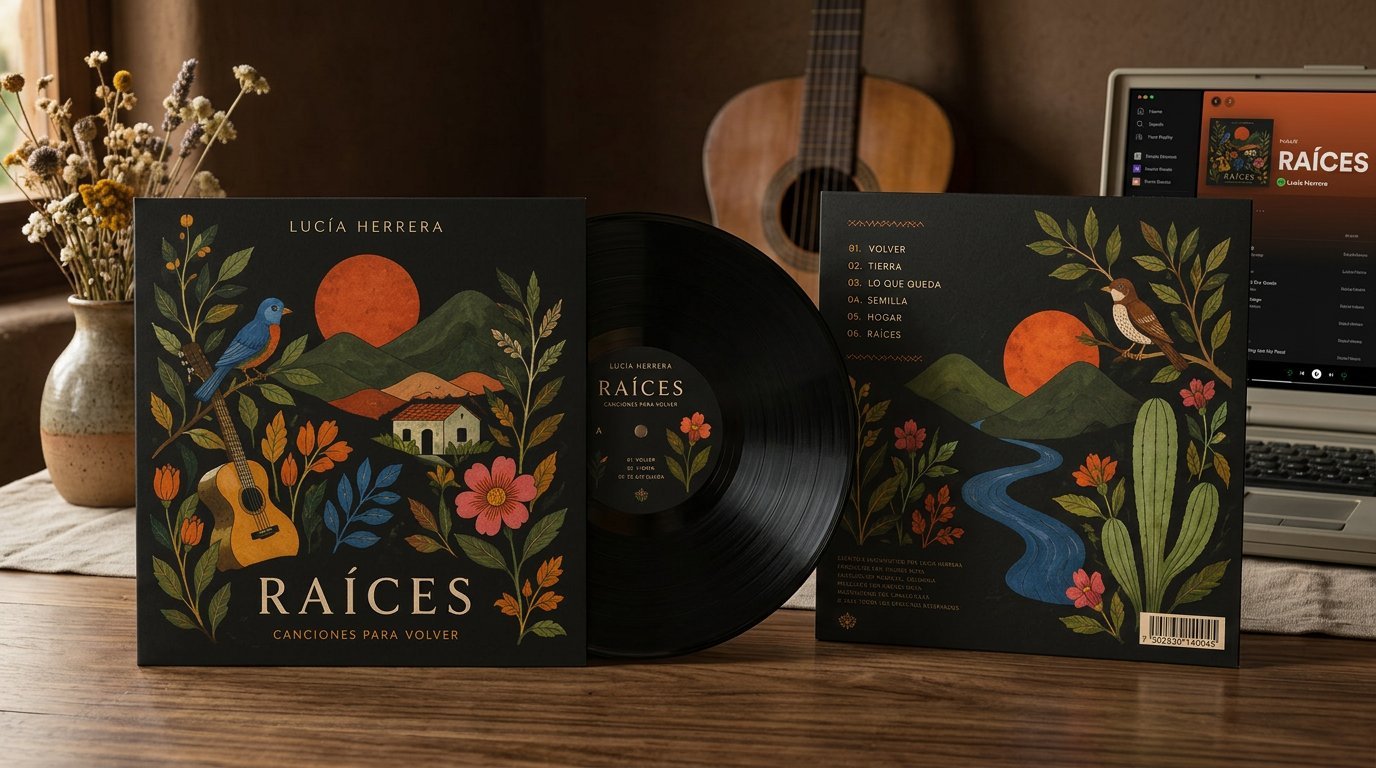
Raíces
Editorial album design for an acoustic record inspired by nature, the return to origin, and simplicity — built around botanical illustration and generous white space.
Raíces is an acoustic record by singer-songwriter Lucía Herrera built around roots, memory, and the quiet act of returning home. Rather than loud commercial album art, the identity favors generous white space and a restrained, literary typographic hierarchy closer to a poetry chapbook. Hand-drawn botanical illustration, refined digitally, anchors the album cover, inner sleeve, vinyl label, and streaming artwork, giving the record a visual language as quiet and intimate as the songs themselves.
The Album
Raíces is the new acoustic record by singer-songwriter Lucía Herrera — a collection of songs about roots, memory, and the quiet act of returning home. The brief called for an editorial identity that could carry that intimacy across cover art, inner sleeve, and digital formats, avoiding the loud visual language typical of commercial album art in favor of something quiet, tactile, and personal.
Concept
The design concept is built around a single idea: going back to the root. Botanical illustration — drawn by hand and then refined digitally — became the visual anchor of the album, standing in for the songs' recurring imagery of soil, plants, and growth. Every other decision, from paper stock to typography, was made to support that single, quiet gesture.
Editorial System
The layout system favors generous white space and a restrained, literary typographic hierarchy — closer to a poetry chapbook than a typical album package. The botanical illustrations are placed with intention, never crowding the page, letting silence and negative space carry as much weight as the linework itself.
Design System & Applications
The system extends across the album cover, inner sleeve and lyric booklet, vinyl label, and streaming artwork — each format adapted to its own constraints while preserving the same botanical motif, color palette, and editorial typography established in the core identity.
Outcome
The result is an album identity that feels closer to a printed object than a marketing asset — quiet, tactile, and aligned with the introspective character of the record itself.