Omugi
Packaging design for a modern tea brand built on restraint — no additives, no shortcuts, and a Zen-inspired visual language for the U.S. market.
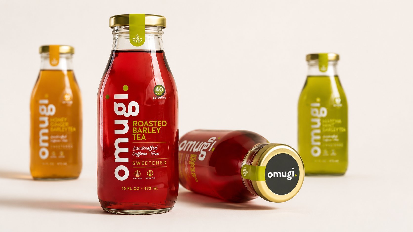
Omugi is a caffeine-free roasted barley tea for the U.S. market, bottled without additives or preservatives. Moving away from the crowded, illustration-heavy language of American specialty tea shelves, the label draws on Japanese minimalism — generous negative space, a bold vertical wordmark, and a single olive-green accent carrying the entire "natural, no additives" message. Built for a 16 fl oz glass bottle, the system reads as quiet and premium rather than loud and competitive.
The Brief
Omugi needed packaging for a roasted barley tea — caffeine-free, non-GMO, gluten-free, with no additives or preservatives. The brief called for a label that could communicate that restraint at a glance: a product defined as much by what it leaves out as by what it contains.
Modern Zen
Research moved away from the crowded, illustration-heavy language typical of U.S. specialty tea shelves, looking instead at Japanese minimalism — generous negative space, a single confident wordmark, and color used sparingly and with intention. The goal was a bottle that felt quiet on a loud shelf.
Label System
The wordmark runs vertically along the bottle in bold lowercase type, anchoring the label and doubling as a design device that works with the glass bottle's natural silhouette. A single olive-green accent — used for the neck tag, the leaf mark, and key callouts — carries the entire "natural, no additives" message without a single extra icon.
The Bottle
The system is built for a 16 fl oz glass bottle with a foil neck tag and metal cap, designed to read clearly refrigerated or on a shelf. Nutritional callouts (40 calories, non-GMO, gluten-free) sit in a small badge that keeps the label uncluttered while covering U.S. retail labeling requirements.
Outcome
The result is a packaging system that reads as premium and calm rather than loud and competitive — a bottle built to stand out by saying less, in a category where most labels are still trying to say everything at once.