Neonu
Label design for a premium yacón syrup entering the North American organic market — where an unfamiliar root sweetener had to earn shelf trust in three seconds.
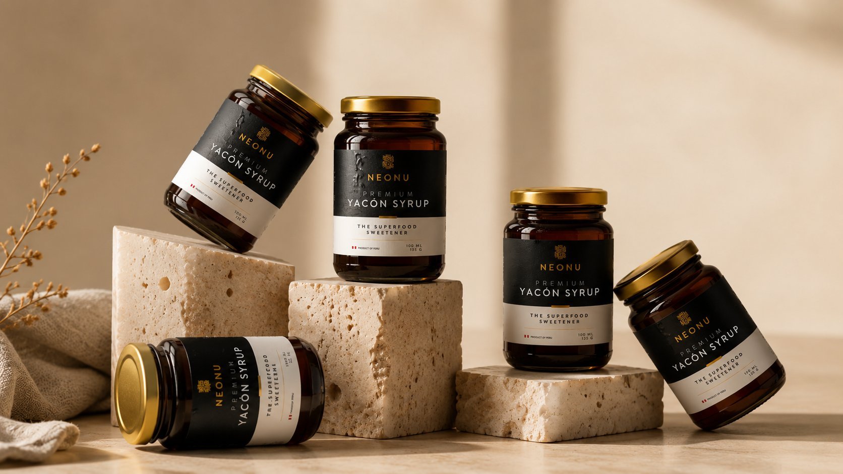
Neonu needed label design for a premium yacón syrup — a low-glycemic root sweetener unfamiliar to most North American shoppers — entering the crowded organic foods aisle. Since the product itself required explanation, the label treats information hierarchy as the core design problem, using a warm amber palette referencing the syrup and a restrained sans-serif to keep the tone premium rather than folksy. The result educates a first-time buyer in seconds while justifying a premium price.
The Brief
Neonu needed label design for a premium yacón syrup — a low-glycemic root sweetener largely unknown to North American shoppers — entering the crowded organic and natural foods aisle. The brief called for a label that could educate at a glance while still competing for attention against established honey and maple syrup brands.
The Organic Aisle
Research into the North American natural foods market revealed a category dominated by kraft paper, hand-lettered scripts, and muted earth tones — visual shorthand for "natural" that had become so common it risked reading as generic. The opportunity was to keep that sense of trust and simplicity while giving Neonu a cleaner, more contemporary presence on shelf.
Educating the Shelf
Because yacón syrup was an unfamiliar product to most shoppers, the label design treats information hierarchy as the core design problem: what it is, how it tastes, and why it matters, arranged so a first-time buyer can understand the product in the time it takes to pick up a jar. A warm amber palette references the syrup itself, while a restrained sans-serif keeps the tone premium rather than folksy.
The Label
The system was designed for a glass jar format standard to the natural sweetener category, with a front label carrying the product story and a back panel organized for nutritional information and organic certification marks — built to meet U.S. organic labeling requirements without crowding the front-facing design.
Outcome
The result is a label system that positions Neonu as a credible, premium entrant in the North American organic sweetener category — clear enough to educate a first-time buyer, refined enough to justify a premium price point next to more familiar honey and maple syrup brands.