Just Pressed
Packaging design for a Canadian organic juice brand — where radical simplicity, not illustration, became the visual signature across nine cold-pressed SKUs.
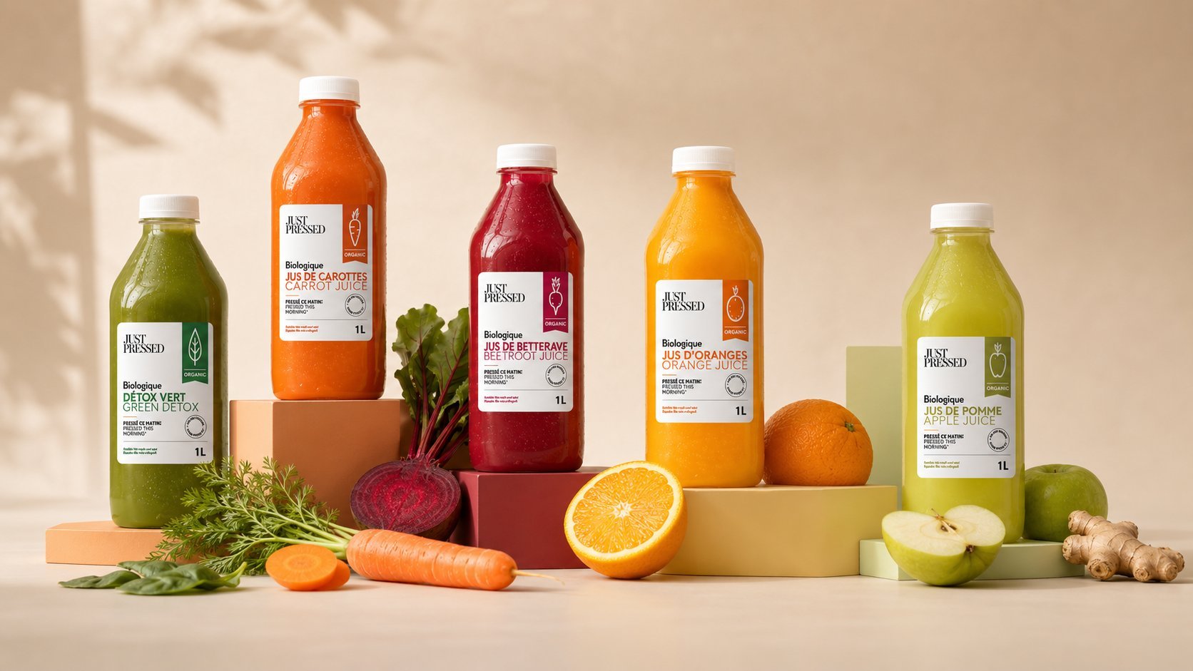
Just Pressed is a Canadian organic juice brand spanning nine cold-pressed SKUs, from carrot and beetroot to nut-based blends. Rather than compete through illustration, the identity leans entirely on restraint: a plain white label, one flat accent color per flavor pulled from the fruit itself, and a single line icon. Every label carries French and English side by side as required for the Canadian market, with an identical 1L bottle format across all nine flavors reading as one collection.
The Brief
Just Pressed needed packaging for a line of nine cold-pressed, fully organic juices — from carrot and beetroot to nut-based blends like cashew. The brief asked for a system flexible enough to hold nine very different colors and flavors together as one coherent, premium family.
Radical Simplicity
Rather than compete through illustration or ornament, the identity leans entirely on restraint: a plain white label, a single flat color block, one line-drawn icon per flavor, and the juice itself as the only real color in the system. What looks simple is the result of stripping away everything that wasn't essential.
One System, Nine Colors
Each flavor is assigned a single accent color pulled from the fruit or vegetable itself — beet red, detox green, carrot orange, apple chartreuse — applied consistently to the icon, the color block, and the flavor name. The result is a shelf presentation that reads instantly by color, even before the type is legible.
Bilingual by Design
As a Canadian product, every label carries French and English side by side — "Biologique / Organic" — built into the grid from the start rather than added as an afterthought. The 1L glass bottle format and cap were kept identical across all nine SKUs, so shelf and fridge presence reads as a single collection rather than nine unrelated products.
Outcome
The result is a packaging system where simplicity itself became the brand asset: nine juices that stand apart from a crowded organic beverage category by refusing to compete on visual noise, trusting the product and the palette to do the talking.