Holmes Cay
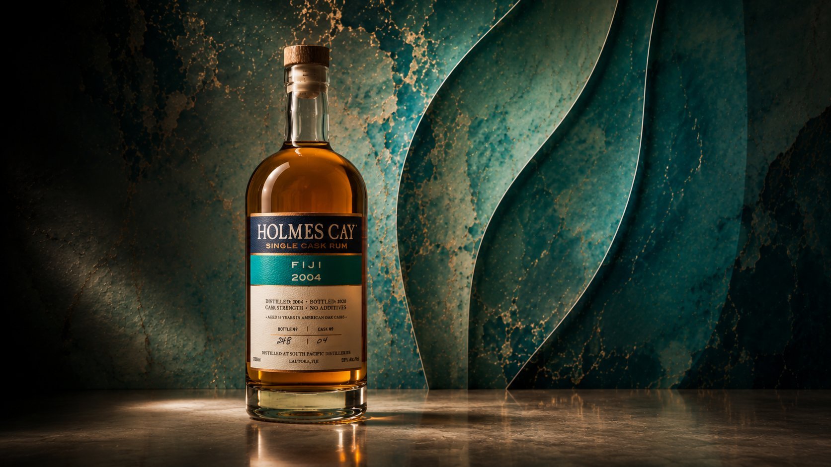
Label design for Holmes Cay's single cask rum program — six origins held together by one radically transparent system, built to read like a spec sheet rather than a marketing label.
Holmes Cay is a single cask rum program built on radical transparency: nothing but rum, no additives, no adulteration, with full traceability to the distillery and cask. The label treats each detail — distillery, country, distillation year, cask number, proof — as a data sheet worth reading, set with the seriousness of a single-malt scotch. Six countries of origin are distinguished by one color band each, while a fixed navy header and wordmark hold the whole program together as one house.
The Brief
Founded by Eric Kaye in 2019, Holmes Cay built its reputation on a simple premise: nothing but rum, no additives, no adulteration, bottled with full traceability back to the distillery and cask. For 2023, the brief was to design a label system for a single cask series spanning six countries — Jamaica, Guyana, Belize, Fiji, Australia, and South Africa — that could hold that radical transparency together as one recognizable house style, one origin at a time.
Radical Transparency as a Design Principle
Most rum labels hide the details Holmes Cay wants to show off. The design approach flips that convention: the label becomes a data sheet worth reading — distillery name, country, distillation and bottling year, cask number, bottle number, proof, and "no additives" stated plainly, all set with the same seriousness a single-malt scotch label gives its own numbers. As Esquire put it, these are rums meant to be taken as seriously as a complex scotch whisky — the label had to earn that comparison before the rum ever touched a glass.
One Label, Six Origins
The Holmes Cay wordmark and navy header stay identical across every release; what changes, bottle to bottle, is a single color band naming the country of origin — forest green for Jamaica, teal for Guyana, oxblood for Belize, deep teal for Fiji, gold for Australia, near-black for South Africa. Below it, the same fixed hierarchy repeats every time: distillery, distillation year, cask detail, hand-numbered bottle count — so a collector can scan six very different rums and read them as one continuous, comparable program.
Outcome
The result is a label system where honesty is the aesthetic: confident enough to read like a spec sheet, distinctive enough to tell six countries of origin apart at a glance — making the case, one cask at a time, for why Holmes Cay is closer to a single-malt program than to a bottle of spiced rum.