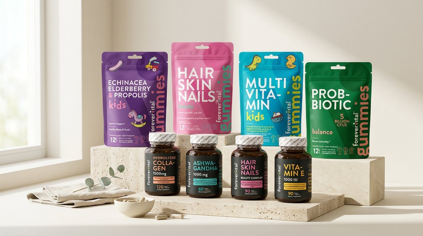
Forevervital — Packaging System
The packaging system that extends the Forevervital identity into physical product — translating a trust-driven brand language into shelf-ready structures across the wellness product line.
This project extends the Forevervital brand identity into physical packaging for a wellness and supplement product line. The label design continues the brand's typographic system rather than treating packaging as a separate exercise, while structural choices — bottle and box formats, cap language, label substrates — were made alongside the graphics for shelf efficiency and a tactile, premium-but-honest finish. The result covers capsules, powders, and liquid supplements as one coherent, scalable system.
The Brief
With the Forevervital brand identity established, the next challenge was translating that visual language into physical packaging for a line of wellness and supplement products. The brief called for structures and labels that felt clinical enough to trust and warm enough to live on a bathroom shelf — extending the brand without diluting it.
Concept
The packaging concept treats the label as a continuation of the brand's typographic system rather than a separate design exercise — the same wordmark, the same color logic, the same generous whitespace, now applied to bottles, boxes, and sachets across the product range.
Structure & Materials
Structural decisions were made alongside the graphic system: bottle and box formats selected for shelf efficiency and recyclability, label substrates chosen for a tactile, premium-but-honest finish, and a consistent cap and closure language across SKUs to reinforce the line as a single coherent system.
The Product Line
The system covers the full Forevervital product range — capsules, powders, and liquid supplements — each SKU distinguished by a clear color-coding system while sharing the same structural logic, typographic hierarchy, and regulatory information layout.
Outcome
The result is a packaging system that functions as the physical extension of the Forevervital identity — consistent, shelf-ready, and built to scale as the product line grows.