Forevervital
A contemporary visual identity for a health and wellness company focused on trust, vitality, and accessibility. The system combines a bold typographic approach with a flexible visual language designed to scale across physical and digital touchpoints.
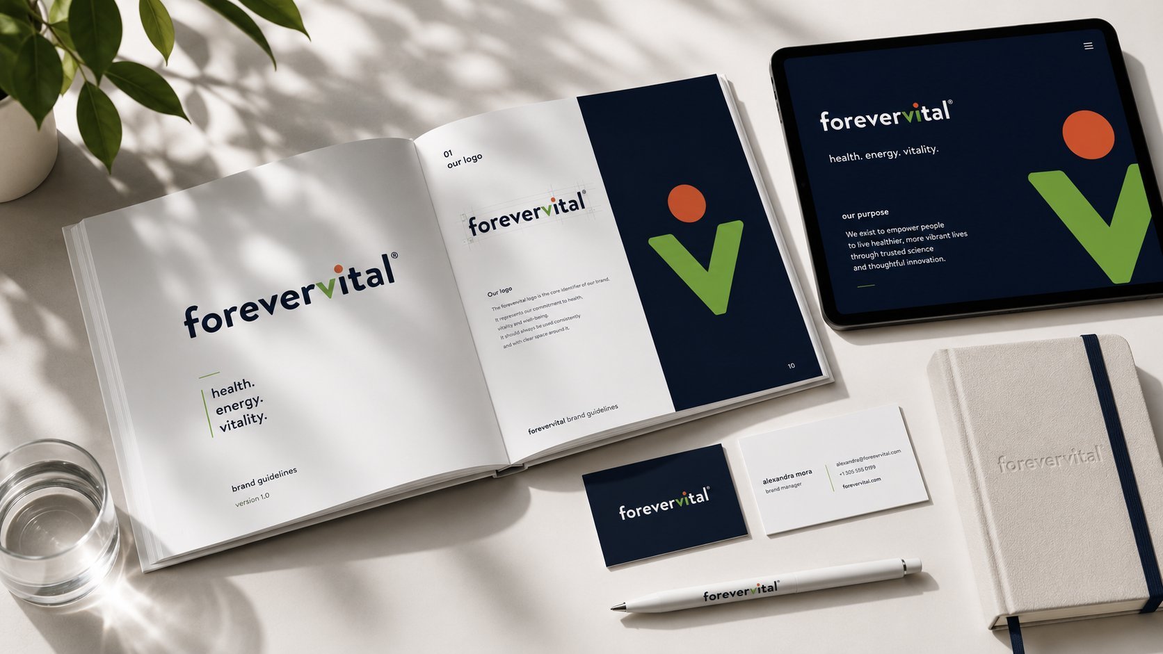
Forevervital is a contemporary visual identity for a health and wellness company positioned between clinical trust and modern wellness. Rather than conventional healthcare symbols, the system communicates confidence and human connection through simplicity, generous whitespace, and refined typography. Delivered as a complete brand guidelines package, it extends across stationery, digital interfaces, environmental graphics, and social templates — built to scale consistently across every touchpoint.
Brand Overview
Forevervital required a visual identity capable of positioning the brand between healthcare professionalism and modern wellness. The project focused on creating a clean, memorable, and scalable identity system centered around a distinctive typographic logo, a vibrant color palette, and a modular visual language that extends consistently across stationery, digital products, environmental graphics, and brand guidelines.
Logo & Identity
Rather than relying on conventional healthcare symbols, the identity communicates confidence, optimism, and human connection through simplicity, generous whitespace, refined typography, and carefully balanced color. The wordmark is the anchor of the system — built to read clearly at every scale, from a favicon to a storefront.
Brand Guidelines
The guidelines document codifies every decision into a clear, usable system: logo construction and clear space, typographic hierarchy, the full color system with accessible pairings, photographic direction, and tone-of-voice principles — built so any team member or vendor can apply the identity correctly without supervision.
Design System & Applications
The system extends across stationery, digital product interfaces, environmental graphics, and social templates — each application governed by the same typographic and color logic established in the guidelines. The modular approach means new touchpoints can be designed quickly without compromising consistency.
Outcome
The result is a flexible identity system ready to scale with the brand — confident enough for clinical trust, warm enough for everyday wellness. Delivered as a complete guidelines package covering every core application.
In Their Words
Forevervital's founder on working through the identity system:
— Hanneka Sabbagh, Founder & CEO, Forevervital