La Concordia
Packaging design for a Colombian single-origin coffee brand — where the traditional tiled floors of Antioquia's pueblos become a visual identity for four coffee-growing towns.
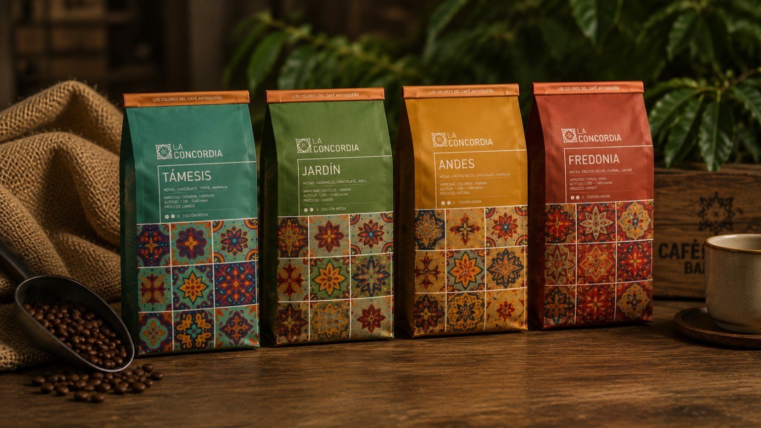
La Concordia is a Colombian single-origin coffee line sourced from four Antioquian towns — Támesis, Jardín, Andes, and Fredonia. The packaging translates the traditional ceramic floor tiles (baldosas) of the region's colonial pueblos into a repeating pattern grounding each bag, with a color per town pulled directly from its own architecture. The result turns the label into a map of provenance, giving each origin its own identity while reading as one coherent coffee house.
The Brief
La Concordia needed packaging for a single-origin coffee line sourced from four towns in Antioquia — Támesis, Jardín, Andes, and Fredonia. The brief called for a system that could give each origin its own distinct character on the shelf while reading unmistakably as one family of products from the same coffee house.
Antioqueño Architecture
Research centered on the traditional architecture of Antioquia's coffee towns — colonial pueblos with whitewashed walls, wooden balconies painted in saturated colors, and the ornamental ceramic floor tiles (baldosas) found in patios, corridors, and church floors. These tiles, with their repeating floral and geometric motifs, became the project's central visual reference.
Tile & Territory
The baldosa motif was redrawn as a repeating pattern that grounds the lower half of each bag — like standing on the tiled floor of the town itself. Each SKU is anchored to a color pulled directly from that town's architecture: teal for Támesis, green for Jardín, ochre for Andes, and terracotta red for Fredonia — turning the palette into a map of provenance.
The Four Origins
The structure is a stand-up kraft pouch with a one-way valve, kept consistent across the line so the color-and-tile system does all the differentiating work. Each label carries the origin town, tasting notes, variety, altitude, and process — the same information hierarchy repeated four times, once per municipality.
Outcome
The result is a packaging system where geography becomes the brand story: four bags that read as a coherent family from across the shelf, and as four distinct places up close. La Concordia's coffee carries its origin town with it, tile pattern and all.