El Club de los Perdedores
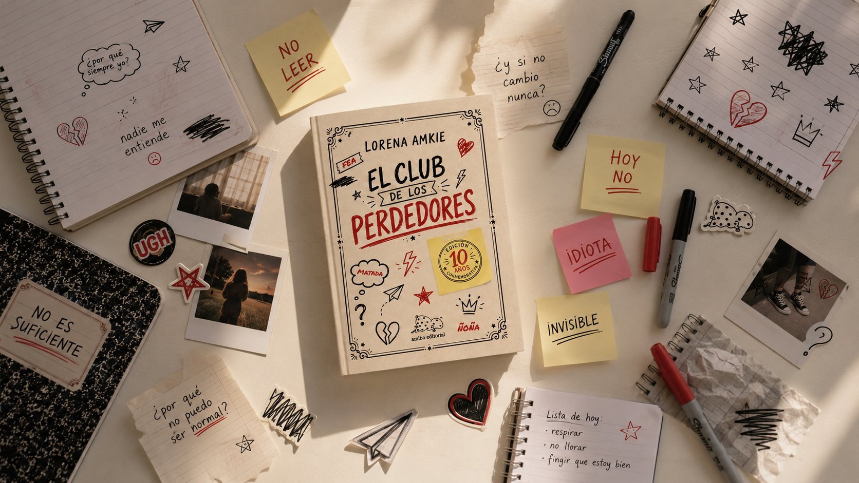
A 10th-anniversary commemorative cover for Lorena Amkie's YA novel, for Amiba Editorial — a scrapbook of marker doodles, tape, and hand-lettering that reads like a teenager's notebook rather than a designed poster.
A cover design for the 10th-anniversary commemorative edition of <em>El Club de los Perdedores</em> by Lorena Amkie, published by Amiba Editorial. Rather than a polished illustrated poster, the cover is built as a kraft-paper scrapbook: hand-lettered title, black-and-red marker doodles, torn-tape labels, and a taped-on yellow sticky note announcing the anniversary — every element keyed to the book's voice of outsider teenage identity rather than to conventional YA cover conventions.
The Brief
Amiba Editorial commissioned a cover for the 10th-anniversary commemorative edition of El Club de los Perdedores, one of Lorena Amkie's best-known YA novels. The challenge: mark the milestone visibly enough for existing readers to spot it on sight, without a full redesign that would abandon the scrapbook voice the book is known for.
A Notebook, Not a Poster
The concept treats the cover as a page torn from a teenager's personal notebook rather than a designed illustration: kraft cardstock texture, marker doodles, and taped-on labels — "FEA", "ÑOÑA" — that reclaim the insults the book's outsider characters are called. A broken heart, a lightning bolt, a paper airplane, and a crown work as a visual vocabulary for the story's emotional beats, scattered by hand rather than composed.
Lettering & Doodle System
The title is set entirely in hand-lettering, split across two passes of black marker for the book's name and a looser red script for its most charged word, "Perdedores," underlined like something written twice for emphasis. An ornate vintage frame borrows the language of an old composition-book cover, while the spine repeats the title and author in the same hand type so the book reads consistently on the shelf.
The 10-Year Sticker
The anniversary mark itself is designed as an object within the scrapbook rather than a printed banner over it: a yellow sticky note, taped on at an angle, stamped with a circular "Edición 10 Años Conmemorativa" seal. Because it behaves like everything else on the cover — a physical thing stuck onto the page — it announces the milestone without breaking the handmade logic the rest of the design depends on.
Outcome
The result is an anniversary edition instantly recognizable to El Club de los Perdedores's existing readers, where the milestone reads as one more note taped into a notebook that was always a little imperfect on purpose.