One Hundred Years of Solitude
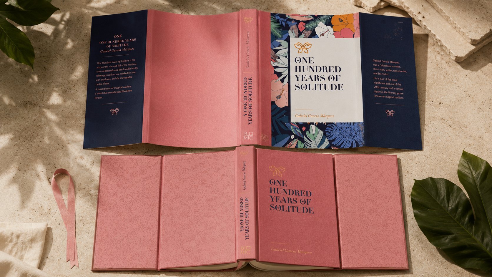
Cover design for the English-language ("Anglo-Saxon") hardcover edition of García Márquez's masterpiece — where the yellow butterflies of Macondo become the visual key to the entire cover.
Cover design for the English-language hardcover edition of García Márquez's masterpiece, created for a market where dozens of existing covers already compete for attention. Instead of the yellow-house-and-butterfly clichés of past editions, a full-bleed tropical botanical illustration wraps the case, with a single gold butterfly referencing Mauricio Babilonia's famous image. A cream title panel, rose cloth spine, and gold foil detailing complete a cover built to feel like a keepsake edition.
The Brief
The brief was to design a hardcover English-language edition of One Hundred Years of Solitude — one of the most translated and reissued novels in modern literature — for a market where dozens of existing covers already compete for shelf space. The challenge: find an image that felt unmistakably Macondo without repeating the yellow-house-and-butterfly clichés of prior editions.
Macondo's Botany
Research returned to the novel's own language: the lush, overgrown tropical world that swallows the Buendía house by the final chapters, and the recurring image of Mauricio Babilonia's yellow butterflies — one of the most quoted magical-realist images in the book. Rather than illustrate a scene, the cover translates the novel's atmosphere into pattern: dense botanical illustration in a saturated, humid palette.
Pattern as Setting
A full-bleed tropical botanical illustration — palms, monstera leaves, and hibiscus in navy, coral, and teal — wraps the case from spine to edge, functioning as setting rather than decoration. A single gold butterfly, rendered as a clean line mark, sits above the title as the book's one direct visual reference to its most famous image, kept small and quiet rather than illustrated literally.
The Title Panel
A cream text panel — floating over the illustration rather than replacing it — holds a bold serif title and the author's name in a warm italic script, giving the eye a place to rest against the density of the pattern. The rose cloth spine and gold-foil butterfly and colophon complete a case designed to feel like a keepsake edition, built to be reread rather than shelved once.
Outcome
The result is a cover that stands apart in a crowded field of prior editions by trusting atmosphere over illustration — dense, tropical, and quietly magical, the way the novel itself builds its world one detail at a time.