La Casa de Bernarda Alba — Edición de Lujo
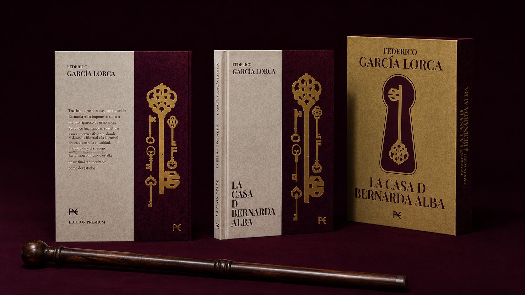
A luxury cover and slipcase for Editorial Universidad de Granada's definitive edition of Lorca's tragedy — a cascade of gold keys standing in for Bernarda and her five daughters, confinement rendered as ornament rather than iron bars.
A luxury edition design for Editorial Universidad de Granada — cover and slipcase for Federico García Lorca's <em>La Casa de Bernarda Alba</em>, produced as a definitive, collectible edition by the university press closest to the author's own birthplace. Rather than reach for the mourning-black-and-iron-bars imagery most editions default to, the design translates the play's central theme — confinement — into a cascade of ornate gold keys on a burgundy ground: one key for Bernarda, one for each of her five daughters, locked into a cream cloth cover. The slipcase repeats the device at scale, a single gold key set inside a burgundy keyhole silhouette.
The Brief
Editorial Universidad de Granada commissioned a definitive luxury edition of La Casa de Bernarda Alba — cover and clamshell case — to mark the play as part of Granada's own literary patrimony; Lorca was born just outside the city, in Fuente Vaqueros. The brief called for a design befitting an academic press's flagship edition: durable, collectible, and restrained enough to sit in a scholar's library rather than a bookstore front table.
Five Daughters, Five Keys
Research moved away from the imagery most Bernarda Alba covers default to — mourning black, whitewashed walls, iron window bars — toward a single symbolic device: keys. In the play, Bernarda locks her five daughters inside the house, controlling every door and every suitor; the key becomes the object of her authority and their confinement. That gave the project its concept: one ornate key for Bernarda, five more for her daughters, cast in gold rather than iron.
Cover & Case System
The cover is bound in cream cloth beside a burgundy panel, where six ornate gold-foil keys — one for Bernarda, one for each daughter — cascade down the spine in a single locked column, sized and ordered to read almost like a family portrait. The slipcase, in gold cloth, holds the same logic at a larger scale: a burgundy keyhole cut into the case front, with one gold key set inside it — the whole house reduced to the one object that runs it.
Materials & Craft
Every surface is gold-foil stamped onto cloth rather than printed, so the keys and title carry real relief under light — the kind of tactile detail that separates a teaching-library paperback from a collector's edition. Cream and burgundy were chosen deliberately over the mourning black most adaptations default to, keeping the object precious rather than somber, with the press's colophon mark stamped small on the case front.
Outcome
The result is a definitive edition built to represent Lorca within his own region's academic canon — where a single object, the key, carries the entire weight of the play's confinement without a single bar, wall, or black dress in sight.