Belle Girl
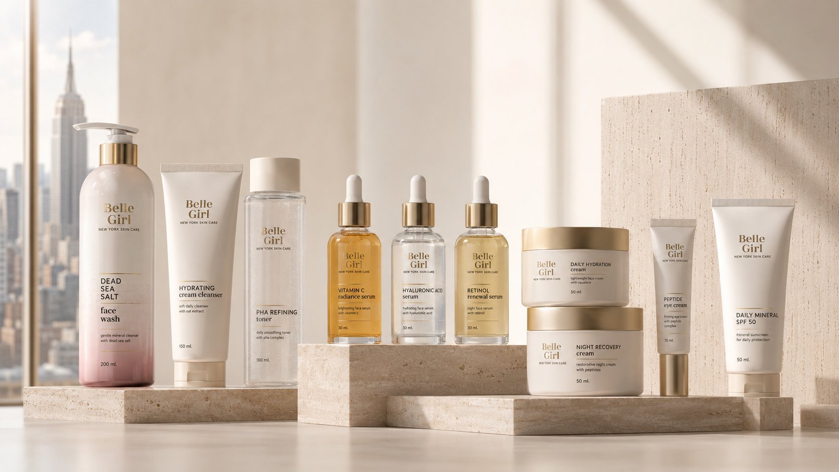
Brand identity and packaging system for a premium New York skincare line — ten products unified by warm minimalism, gold accents, and a consistent shelf language.
Belle Girl is a premium New York skincare line spanning ten products — cleansers, toners, serums, moisturizers, and sunscreen. The brief called for a packaging system warm enough to feel considered rather than clinical, and consistent enough to read as one collection across very different bottle, tube, and jar formats. A refined serif wordmark, gold foil accents, and a soft neutral palette tie every SKU together, positioning the brand as quiet luxury in a crowded premium beauty category.
The Brief
Belle Girl needed a complete packaging system for a ten-product skincare line — cleansers, toners, serums, creams, and sunscreen — launching as a premium New York skin care brand. The brief called for a single visual language capable of holding together bottles, tubes, jars, and boxes across very different formats and textures.
Quiet Luxury
Research looked at the shift in the premium skincare category away from clinical whites and loud actives-first labeling, toward a warmer, more editorial minimalism — soft neutrals, a restrained serif logotype, and gold foil used as the only ornament. The goal was a shelf presence that reads as considered rather than manufactured.
One Wordmark, Every Format
The Belle Girl wordmark — set in a refined serif with a gold rule beneath it — anchors every format identically, from a pump bottle to a small eye cream tube. A warm, blush-to-neutral palette shifts subtly by category (cleansers, serums, moisturizers) while keeping the whole line legible as one collection rather than ten separate products.
The Line
The system covers ten SKUs across four formats — pump bottles, squeeze tubes, dropper serums, and dual-layer jars — each labeled with a clear, hierarchical callout of ingredient, format size, and key benefit. Secondary packaging for serums and treatments repeats the same gold-accent language to reinforce the unboxing experience.
Outcome
The result is a packaging system where restraint reads as premium: a ten-product skincare line that feels like a single, considered wardrobe rather than a shelf of unrelated bottles — ready to compete in the crowded New York beauty retail landscape.